Overview
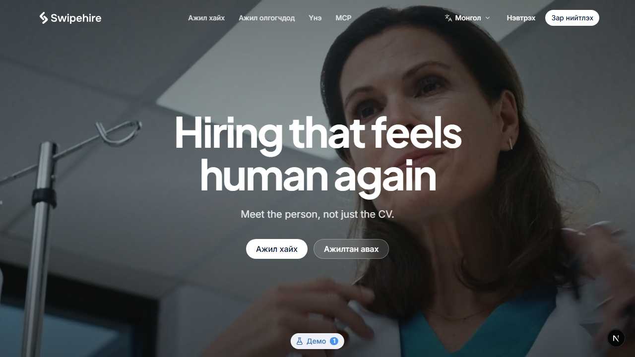
Swipehire is a hiring platform for the Mongolian market. An employer posts a job with up to ten questions they actually want answered. Candidates apply with one reusable profile and record their answers on video, from home, on their own time. The employer watches, rates, shortlists and decides in one place.
This is a working clickable prototype — every screen, both sides, in two languages, running on sample data. The MVP build comes next.
A redesign, not a new product
Swipehire already existed as a swipe-first mobile app. It was not working, and an alignment review found four specific reasons. The redesign is the answer to each of them.
The swipe did not mean anything. A job card had a ✓ and an ✗, and nobody could tell whether those saved the job or applied for it. Search and filters were not even visible. So candidates now browse, save and apply with buttons that say what they do. Swiping survives in exactly one place — an employer moving candidates through stages, where approve and reject are genuinely what the gesture means.
A video CV misjudges people. A free-form intro video measures confidence on camera, which is not the same thing as being able to do the job. It replaced the CV with a structured interview instead: the employer writes the questions, every candidate answers the same ones, and the comparison is finally like-for-like.
Charging job seekers does not fit this market. Employers pay. Candidates use the whole product free, permanently. The first job post is free too, with monthly plans after that.
Onboarding asked for everything up front. Sign-up is now minimal and the profile fills in as you go. People want to look around before they commit.
Designed around the waiting
The part of job hunting that hurts is not the application. It is the silence afterwards.
So the candidate side is built to always answer the question "where does this stand?" The dashboard leads with what needs doing and by when — an interview with three days left, a draft application never sent — then every application with its real status underneath.
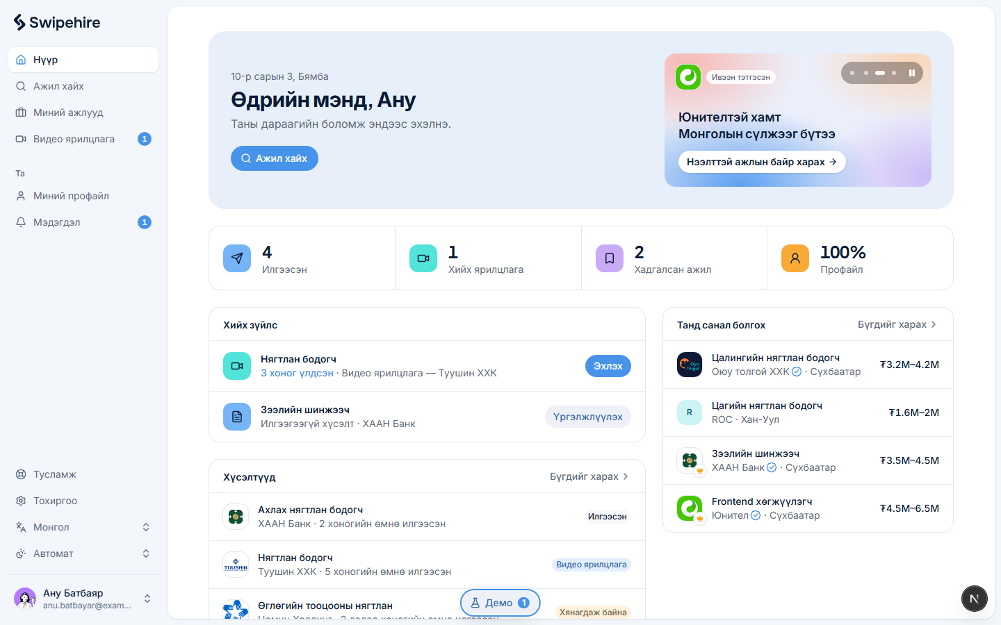
Everyone who applies gets a reply, including a rejection. That sounds like a small product decision. In a market where applications usually vanish, it is the whole promise.
Mongolian first
The product is in Mongolian by default, with English second — not the other way round, which is the usual shape of software here.
That reaches further than translated strings. Salaries are in ₮ and read the way people say them. The sample employers are real Ulaanbaatar companies. Payment is QPay, with an e-barimt tax receipt issued against the company's registration number, because that is what a Mongolian business needs for its books. Candidates can verify their experience and diplomas through DAN, the national e-authentication service.
One detail I like: the display typeface has no Cyrillic, so Mongolian headings fall back to the body face. Not ideal, and the right trade — a heading in the wrong face is survivable, a heading that cannot render the language is not.
Built on my own design system
Every screen is assembled from FramebookUI, a shadcn-compatible component registry I publish and install from with the normal CLI.
Running a design system as a package rather than a Figma library changes what "consistent" costs. There is no drift between a documented component and the one in the product, because they are the same artifact. For a solo designer who also builds, that is the difference between shipping two sides of a hiring platform in two languages and not shipping them.
Where it is now
A complete clickable prototype: candidate and employer apps, the marketing site, admin, light and dark, Mongolian and English. All data is sample data living in the browser — nothing is sent anywhere, and a demo switcher drops you into any sample account to walk the flows.
120 commits in ten days to get there. Next is the real build: the video interview loop end to end, then payments, then mobile.